Friday 29 May 2015

Review of Final Major Project

1. Briefly describe the final outcome of your project and the progress you have made, and if applicable how it differs from your original Project Proposal:

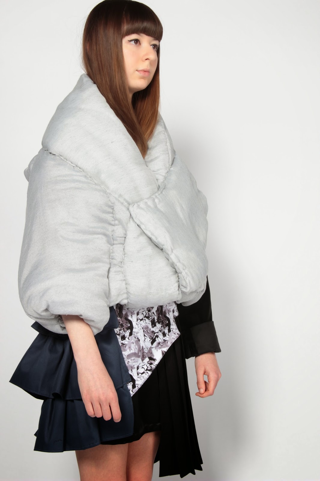
The outcome of this project was an eight piece collection, a coat and skirt and a photoshoot. I think I have progressed from my initial proposal and explored a range of ideas. I ended up changing some of the ideas I had planned to explore in my project proposal and going down a more visual route of exploring rich and poor rather than the more emotional and conceptual ideas I had originally thought of, such as looking at treatment of both and the emotional strains of wealth, as I didn't think this overly suited my style of working. I ended up looking into the realities of the different sides of society: the struggle of keeping warm on the streets, the conditions of living, rubbish on the streets compared to glamorous and obscene interiors. I also used detailing found in typical rich and poor clothing which I had set out to do in my proposal.

2. What methods have you used to show how your learning has effected your project eg FMP Blog/ FMP Plan/ sketchbooks etc, and how has this helped with development of your work:

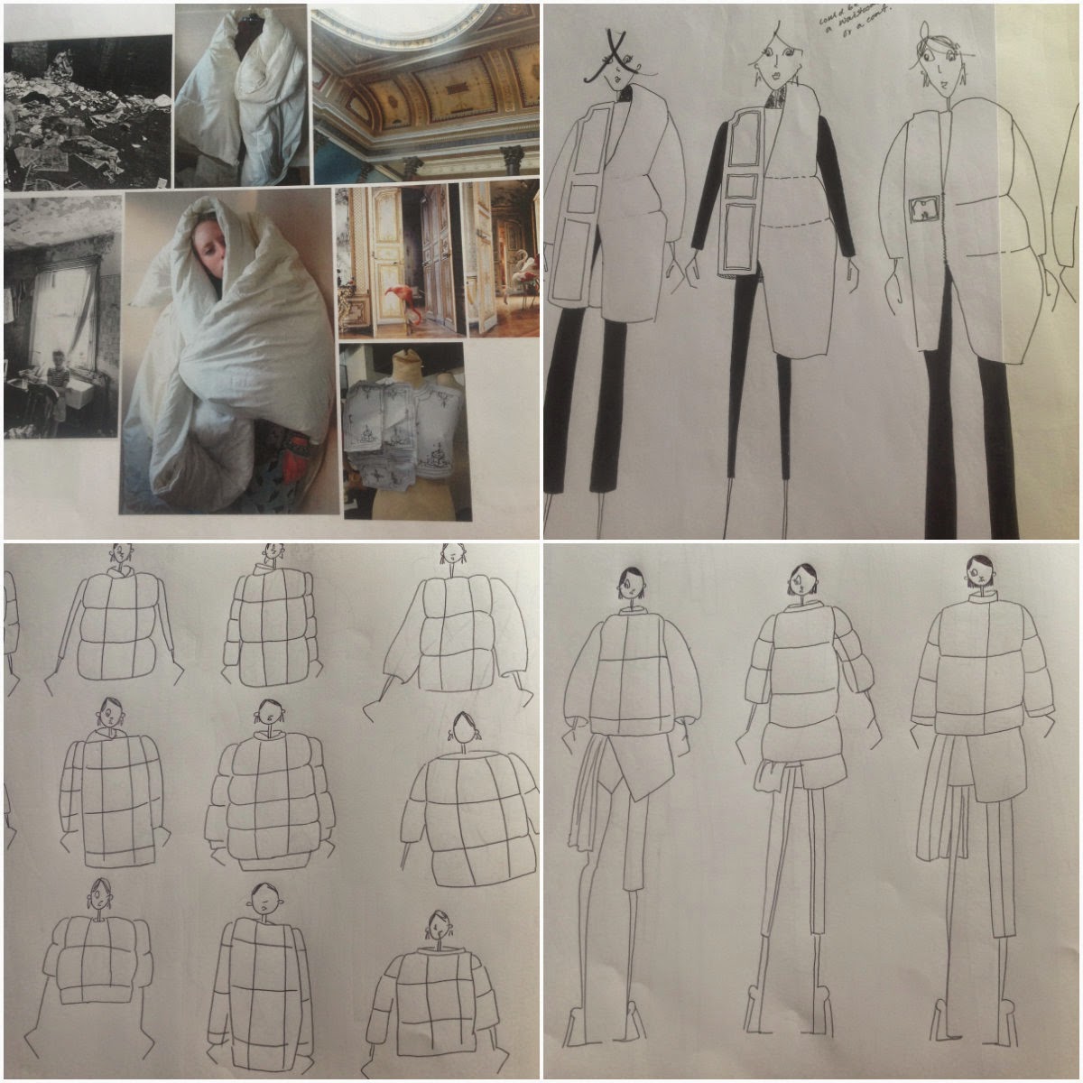
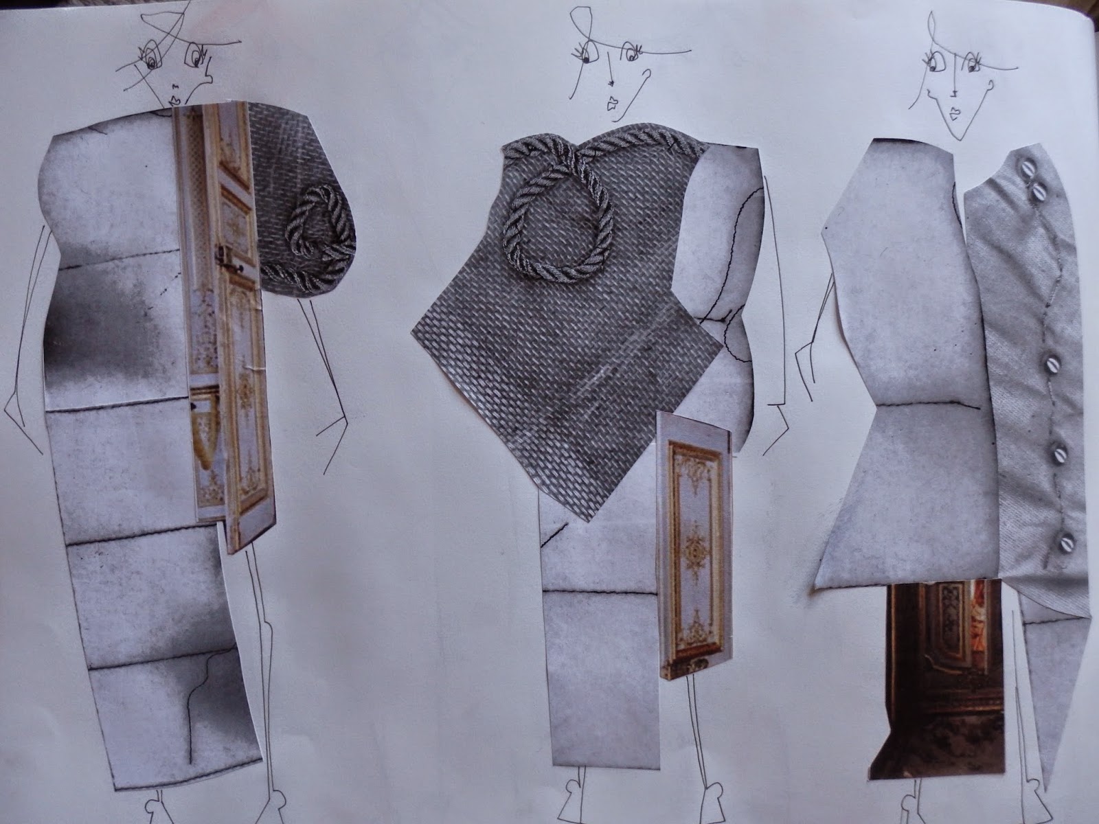
Throughout the project I found my blog very helpful in developing my work as I got into the routine of writing it on my journey home from college meaning that I was always reflecting on what I had done that day. This meant I could see more easily what was and wasn't working as I went through the project which guided me through my ideas and into developing what was successful and improving what wasn’t. It also meant if I was stuck I could write down what wasn't working and discuss this which I found helped me to find a new direction or idea to move forward. I also used my sketchbook to develop the project as having all my work in one place meant I could work through ideas visually and I could see what ideas were working and what I could keep developing. My sketchbook and the visual record of my working meant I could continually analyse my drawings and work to see if silhouettes and shapes had potential and whether my work was diverse enough as I do have a tendency to continually design similar silhouettes. The sketchbook meant I could see this and could try out new ideas with different silhouettes which then made my outcome much more exciting as I had contrasting shapes such as the duvet with a structured skirt rather than just a duvet coat which I had been originally doing. 

3. List the targets met (from the original FMP Plan and any that were added later):

-Explore the different sides of society- rich and poor
-Use a range of primary and secondary research
-Interview/ Survey a range of people for opinions on wealth
-Try and use a range of designing techniques- standwork, collage, quick sketching etc
-Create a 3D outcome
-Create a final collection
-Write on my blog at least twice a week

4. Reflecting on your overall final major project, please discuss any developments which have contributed to the final outcome:

I think my development in print and colour has contributed to my final outcome and made it stronger. Throughout the project I experimented with print and doing this meant I improved a lot and managed to create prints with lots of detail and layering while also learning the technical skills of it such as eliminating trap lines to create a smooth repeat. I didn't know how to do this at the beginning of the project and it made my prints look more professional. I also tried hard improving my use of colour in the project and although I didn’t use particularly vibrant colours I tried hard to establish a colour scheme of blues, greys etc which I could use in different ways and also which complimented the prints well which I think made my final collection stronger. 

I also tried to improve my draping on the stand in the project using both duvet and fleece to create silhouettes and shapes which I probably wouldn’t have as easily designed on paper. This led to me creating a final piece using the draping technique, which I hadn't used since the first project, that was completely creating by draping a duvet on stand and which I think wouldn’t have turned out as well if it was pattern cut as would have lost a lot of volume. 

5. Please state what advice you received from others during your FMP, and discuss what you found particularly useful: you should refer to group reviews, one-to-one tutorials and feedback from evaluation groups

I found the one to one and group tutorials we had very helpful throughout the project. I found them particularly helpful if I was stuck on my ideas or was doubting myself. Talking through my project one to one with a tutor helped me to see what was working the best as it was an observational perspective of my work rather than my own view so helped me to gain a clear look of what I could do next to move the project on. With group tutorials it was also helpful to gain perspectives from others as well as see what they were doing as it showed different techniques of working that I maybe didn't use, as well as gaining feedback on what others thought of my project and what I could add to it. Main suggestions were things like needing to add primary research or colour so my ideas were clearer. Talking one to one with tutors also helped with improving techniques as well as ideas as they told me whether my sketchbook was working and when I needed to add in more reference and colours to make sure it was continually interesting as well as technicalities with print and how to fix issues like trap lines. Opinions on my work from professionals from industry like our tutors helped to see how I could improve as a designer generally, like ensuring using technical drawings as well as fabrication, as well as just improving the project.

6. Key points to take away – things to change about my approach (give at least 2) eg improve time management, what skills you have developed and how this will affect your future course/career and things to continue doing and to build on (give at least 2). What are you going to do next year?

There are a few things I have learnt from this project. I need to make sure I don't just draw in future projects, I need to make sure I include colour and reference and stand work in with my drawing as it is much more interesting to look at and also helps ideas develop more successfully as encourages different techniques and silhouettes. Doing this continually as I am working rather than going back and adding it in will make it more useful to me in terms of working and hopefully push me further. Another key thing I must take away is that I need to continue to make sure I push my shapes and silhouettes as I still tend to repeat ideas and shapes in my sketchbook as I have found I do throughout the year but I must make sure I push ideas and create alternative silhouettes. I managed to do this by the end of the project after some guidance from a tutor to add in contrasting ideas as this definitely helped with my final collection and making it more exciting. Possibly pushing my ideas to be more abstract or contrasting could help me do this as would give me more knowledge of a broader range of ideas which I could use throughout my work. I think skills I have improved are print and this is something I shall try and use more next year on my fashion design course. 

Next year I would like to continue to develop my use of colour as it greatly improves a project and sets the mood, I began to improve on this in the project but I can definitely improve it more next year. Adding in colour right from the beginning stage of a project rather than later on will help with this in future projects. Fabrication and my understanding of fabrics is something I also want to improve on in future projects as will improve my work as a designer and knowledge of what fabrics to use for different projects and garments. Finally although I did not do much pattern cutting in this project, I think what I did do was a development of my skills and definitely something I can continue to develop in future projects. I think experimenting with silhouettes using toiles is a technique I could use more to experiment in 3D ways and this will continue to develop my use of shape and pattern cutting improving my work. Finally illustrations is something I didn't get to add in to this project and I think learning more about illustrating and practicing more would help my confidence with drawing in the illustrative style and could add more exciting outcomes to projects. Illustration is also a whole different way of portraying the mood and story of a project as well as ‘my woman’ who I am aiming my work at.

From this project I can see my strengths (quick sketches, print, photoshop) and weaknesses (colour, fabrication, diversifying ideas) and I can learn from these in my degree next year and knowing them could help in my learning to push me to really explore ideas and improve further on techniques.

Friday 22 May 2015

Outcome- Photoshoot


My final five images from the photoshoot.

Model: Darcy Williams
Photographer: Jess Coomber
Outfit: Jade Goodwin

Photoshoot- Behind the Scenes

(On set, authors own, 22/5/15)

I decided to do a photoshoot of my final garment to show it in an environment related to my theme. I picked to do it in a park local to my house, there is a shelter where the homeless are known to have slept so I thought with this story and the basic look of it, it would make a good backdrop. Having a bench in it too it also gave the option of sitting and standing shots. I also ended up taking pictures against this old shed door too as I liked the dirtiness of the paint and its rough appeal.

I kept the styling simple as this is not a strong point of mine. I wanted a slightly messy, disheveled appearance as a contrast to the outfit which ended up looking quite sleek. Overall I am quite pleased with the photos, they do have a rawness and not perfect look to them which is what I had wanted. I think to improve I would have researched a bit more into existing photoshoots to understand a bit more about backdrops and looks etc so I could have directed my model better and maybe got some better shots of a range of poses. I also could have tried collaborating with a student who studies fashion promotion so I could have learnt more about styling and generally directing a photoshoot. 


(Selection of edited and unedited images, authors own, 22/5/15)

I played around a bit with the editing of my photos. Above is a selection of what I felt were the most successful images. I experimented with changing the contrast and curves level of the photos as well as the brightness. In the end I found the shadows and highlights tool most successful as it meant that in the photos there was more detail as part of the outfit were not hidden by shadows or bright light. I also after playing around with black and white etc decided to keep the photos quite raw and natural so there wasn't any intense shadows or highlights but natural variation and this ended up achieving what I thought was the best look to the photos. Also initially I chose some of the more posey photographs but after experimenting a while changed my mind as a lot of these had a lot of leg in them which almost took away from the outfit which was the focus. I ended up trying to pic the photos which showed off the coat and skirt best rather than feeling too unnatural and over posed. 

Thursday 21 May 2015

Outcome- Studio Shoot


Final images from the studio shoot featuring Jasmine as my model. 

Overall I am really pleased with these photos the proportions of the outfit work really well on Jasmine and the skirt and coat balance well which was something I had been worried about. The colours flow well too and although the coat dyed a lot lighter than I planned this works well with the dark skirt and creates a contrast.

Wednesday 20 May 2015

Outcome- Illustrated Collection


This is my final illustrated collection for the project. I have tried to combine my favourite elements of rich and poor of staying warm in a duvet, layering and details from suits, frills, oversized pockets and a touch of embroidery. I also decided to keep the collection quite monotone with just flashes of blue to create a greater emphasis on silhouette and shape. Overall I am pleased with the flow of the collection and also how my prints tie in, as print isn't something I had expected to use in the project. I am also pleased with the silhouettes, I feel I managed to improve my designing of trousers/ skirts and these have worked well with the oversized duvet coats. I will analyse the outcome more in the end of project review.

Tuesday 19 May 2015

19/5/15- Photoshoot

(Front view, authors own, 15/5/15)

Today I had my work photographed by Ravensbourne for the slideshow in our exhibition. These are some of the photos I took today showing how it was photographed and my finished garments. Overall I was pleased with it, the coat and skirt looked good on my model and the proportions worked well which was something I was worried about. The fit was also very accurate which was something I had learnt about more on this project and meant that the garments felt like they were meant for Jasmine. I also enjoyed today seeing how a photoshoot works as I had never really experienced one before but seeing how much of a difference the white background and lighting makes on making your garments stand out and look professional was really exciting. 

If I were to do this photoshoot again I think I could possibly consider the styling more as I didn't really give it a great deal of thought so went very simple. I think I could have played around with hair or make up or even shoes with this look to emphasise my theme of rich and poor. However overall I think today went well and I am looking forward to seeing the photographs when I get them. 

(The photographing of my garments, authors own, 15/5/15)
(Different views, authors own, 15/5/15)

Sunday 17 May 2015

17/5/15- Coat Construction

Today I focused on creating my duvet coat. At the start of the day I was stuck on the left side of the coat, I was happy with the right side but the left felt messy and uneven and I didn't like the sleeve shape I had created last weekend. I also needed to shorten it as otherwise it was going to cover up my skirt I have made so wouldn't look right as an overall look. I decided to just experiment with creating a sleeve by draping the duvet in different ways till I was happy with the shape. I had to think about keeping volume while creating a smooth shape as this is what I had designed and this is what I wanted so that it created a contrast to the structured skirt. After draping a while I managed to create a simple sleeve that works with the rest of the garment and is voluminous. I had to sew the coat together by hand because of the thickness of the material with the duvet stuffing. Overall this went fairly well, I think possibly I could have been a bit neater with my stitches as they are quite obvious in places which does make the appearance a bit lumpy in places. This looks okay were fabric is joining but in some of the more smooth areas the stitches are very obvious so I may need to remove these as may come out bad when photographed. I then added poppers to the coat to make it functional and wearable.

(Constructing duvet coat, authors own, 17/5/15)

I think if I were to improve the coat I would dye it again so it was darker in colour as it is very faint and I think I slightly stronger colour would look better. I like the feel of the coat as is voluminous so does feel like your wrapped up in a duvet which is what I had hoped to achieve, especially around the collar which is large and wraps around your neck. Next I am going to finalise my final collection so I can create interesting illustrations as well as flats and technicalities this week which will help round up my project. I am also going to plan a photoshoot for my garments which I hope to do Friday so I need to consider location and details possibly looking for existing shoots as inspiration. I don't have experience with photoshoots etc so I am going to try talk to my promotion friends at Ravensbourne to get any advice and tips.

(Duvet coat, 17/5/15)

Friday 15 May 2015

15/5/15- Skirt Construction

Today I worked on making my skirt. Throughout the week I have been creating the toile for my skirt and I am happy with it so today I finished cutting out my fabric and began constructing it. I had already sewed the basic underskirt together last night so using the pattern I made yesterday I added the facing to the waist as to discreetly neaten the top edge. This worked well and gave a flat edge so when the overskirt is added it shall not be bulky. After this I had to sew my overskirt together which is constructed like an apron and will be tied over the underskirt. Overall this went well, I had to sew the pleats, printed panel and ruffles together to the waistband. I had to be careful with this as having multiple elements meant it could get bulky. At first with the printed front panel I made it with a back so all the raw edges were enclosed but once I had done this I realised it was just too bulky to be sewn to the waistband, I had already clipped the inside edges as it was being turned inside out which would have been a problem but luckily as the fabric doesn't fray I managed to still create hems on the edges by just folding them very small and sewing. Although this did mean there was stitching on the outside I made sure it was neat and close to the edge. Once I had sorted that out I sewed the ruffles down the side zigzag stitching the raw edged to make sure they didn't fray and so were secure.

(Constructing my skirt, authors own, 15/5/15)

Overall I am really pleased with how the skirt has turned out. It didn't end up being too bulky which I was worried about and I am pleased with how the colours and fabrics have worked together. I have learnt more about constructing garments from this as I was unsure at the beginning of how I would construct the different elements together. I also think my sewing skills generally were more accurate as I wanted to keep the skirt looking neat and I usually tend to make little mistakes when sewing but I managed to avoid these and apart from changing and unpicking the panel at the front to make it less bulky the construction went smoothly. If I could improve it I think I would change the fabric of the pleats to something that would hold its shape a little better so they were sharper and held the lines of the pleats better when hanging. 

Next I need to construct my duvet coat ready for Tuesday so it can be photographed with my skirt. At the moment the shape of the coat is going to need more experimenting to get it right and I also think I am going to have to shorten the coat otherwise it is going to cover up all the detailing on the top of the skirt.

Thursday 14 May 2015

14/5/15- Garment Development

Today I continued with the making of my skirt, working out the final sections in calico and paper on the stand to get the correct shapes as well as cutting out my fabric ready for making. I mainly worked out a lot of my shapes by eye and experimenting or by building off the basic block. By making the toile onto the stand it has allowed me to amend sizes such as the width of the ruffles or the fullness as I am making so the different elements are in proportion. One element of this I have found quite hard is getting the length of the garment right as I feel the mannequin only basically being the torso or trunk of the body gives a slight distorted view of length so I have to make sure I continue to measure it against a body to ensure I make the garment the correct length. Now I have worked out my toile pieces and pinned them together I can begin to sew the real skirt together as I am happy with how it looks. A lot of my garment is about accuracy and keeping all the elements neat so they flow as one so I need to make sure I sew accurately and press it correctly as otherwise I think it could look messy which will ruin the skirt.


Today I also spoke to Becca about my sketchbook and improving it as it doesn’t feel very exciting at the moment. I believe my issue is I just draw into my sketchbook designs as I think of them knowing what they should look like in my head so I forget to include reference or colour or samples/ stand work with them to explain my ideas so I now need to just go back and improve on this. Key points I need to work on are: adding in references, loads of colour and fabrication, involving my stand work more and making sure its not just all drawing. The method of making sure there are always three different methods and processes on a page is really applicable to me in order to make someone understand my thoughts and processes. Speaking to someone else about my work was helping as it gave a clearer idea of what was missing and what wasn't working which I couldn't see so well as it is my own work. 

This weekend my main focuses are going to be my garments and getting them finished so they can be photographed tuesday so that I can go back and improve and tidy up my work so it is as high standard as I can get. In the back of my mind I also need to be thinking of the best way to display my work in an interesting way at assessment that represents what my project is about. 

Wednesday 13 May 2015

13/5/15- Garment and Print Development

Today I got both my test prints and my final samples printed. I got them in a range of sizes from a5 to a3 and in both fleece and satin so that I can make boards next week. Overall I am pleased with how they have turned out, the prints are strong and seeing them on fabric gives me a better idea of what scales were good as well as the colours. From printing them I like the damask print with a background as it sort of brings both the rich and poor elements together whereas with the rubbish print I like it with a white background as it gives a really bold contrast of black to white making the print more dramatic, I also found the background took away from the details like the small areas with newsprint. I am also pleased that none of the prints have ended up with trap lines and I feel like they do flow and don’t appear to be too repetitive or linear which is something I was finding earlier in the project. In future with prints I think it would be good to play around with more fabrics, I only tried out three but I think testing on a hessian or something rougher would have been a good experiment and might’ve created an exciting outcome. 

(My prints, 13/5/15)

Today I also continued to work on the toile for my skirt, I think it is slowly coming together and I am working out how to create the elements of it. Today I experimented with the ruffles down the side, they are created using rectangles and gathering the top edge, I found from creating them on the stand that they needed more fabric so were fuller as I think they need to be quite dramatic. I now need to translate this back onto paper to make a pattern piece for them. Tonight I am going to begin constructing the skirt as I feel I can create the elements as I work them out which will stop me getting behind. I am going to create the pleated section so I need to be careful to make sure they are accurate and that I iron them properly. 

(Developing toile for my skirt, 13/5/15)

I think at the moment I need to remember to work on my final line up for the project as well as work on my garments as otherwise I will be rushing it next week and not have the time to do finishing touches well and to a high standard I will be happy with. Tomorrow I need to continue constructing my skirt as well as continue designing. I also want to think about a simple top I could make to go with my skirt and coat as I think this will be better for having my garments photographed next week as will be a complete look. 

Tuesday 12 May 2015

12/5/15- Pattern Cutting

Today I began pattern cutting for my skirt. I started with a basic skirt block that I cut out and using my models measurements altered. This basic shape is for me to build on top of. After talking to Becca I am going to create the pleats and ruffle details on a band to be put over the top of the skirt as this is the best way to add all the detail without affecting where I can put a zip and without it being too bulky. I also decided that I was going to add a printed panel to the front of the skirt instead of the part of a suit jacket as this was also proving to be too bulky and I would like to include the print as I spent the time designing them.

I think the pattern cutting went quite well today, I feel a bit more confident with it and I also feel I understand pleats now which I didn't know how to do before. I also feel that developing the garment on the stand is helping me understand what is working and this is why my ideas have changed. Today I also went to get fabric for my skirt, I have decided to use a cotton drill for the ruffles as has some body and will hold its shape and a fairly thin cotton sateen for the pleats as it will mean they will as well as hold their shape will drape too. For the printed section I am using a fleece as it has a really nice texture when heat pressed and I think I can use it to hold the shape which will be reminiscent of a suit collar using interfacing to stiffen it. I am still stuck on what fabric to use for the main body of the skirt as I think I need a shiny fabric possibly to bring back to richness I have been looking at. I am going to look at more fabrics tomorrow to decide.

Tomorrow I need to carry on making my skirt starting to construct it properly as well as finishing my toile. I need to remember to record my process as I am working as I am finding I am changing my mind quite often. I am also going to print out my final fabric samples as well as the panel for the front of my skirt.
(My skirt toile progressing, authors own, 12.5.15)

Monday 11 May 2015

11/5/15- Developing Print and Duvet Coat

This weekend I have spent my time developing my prints, correcting the trap lines and experimenting with scale and experimenting with colour. I think I have improved with print in this project I have a better understanding of repeating them and using the offset tool as well as what works well in the print. I think from further developing the prints I have found that using a background colour completely changes the look of the print, it can lift it or change the mood to be more cold/ dark etc. The two prints below are my favourite, they combine the different elements of the project but have moved on from my initial designs and feel more interesting. I think I could improve them by playing with scale more thinking about how they would work on garments and how the size of the print would look. I also need to think if I actually want to use them on a garment because I'm not sure whether they are ready for being put onto a garment as I don't think I have developed them enough onto designs so I think I will just print them as final samples and put them on a board for presenting with my work.

Today I began draping my duvet coat. I dyed it yesterday using Dylon and sadly it came out more of a silver shade rather than a pewter but I am going to work with this and mix it with dark colours so it has a greater contrast to the rest of the look. At the end of today I am also not happy with how the shape has worked out, it looks quite lumpy and I think I need to re-drape it to see if it can look better possibly trying to bring back more volume to the coat. I like having the velvet sleeve with it though which is a developed from my initial idea and I think it brings a contrast and an element of the rich into the duvet. 

Tomorrow I need to create a toile for my skirt so I can know how much fabric I'll need so I can buy it and start making it. I haven't decided completely what fabrics I want in my skirt so this is something I also need to decide tomorrow. I am getting quite worried at the moment with the amount of time I've got to make the garments but I know I can do it once I have the pattern pieces sorted. 

Thursday 7 May 2015

7/5/15- Design Development

Today I continued to generate design ideas working with my designs from yesterday and finding the shapes which work the best. I have also been trying to add flats into my designs so I think about the technicalities of my designs and how they are actually constructed as this is a very important part in understanding the clothes that I am designing. I think from drawing flats I am getting better at them but I could do with being more accurate at times and precise so that I ensure my proportions are correct. Doing this is also allowing me to think about where features such as seams and zips are being placed meaning my designs have greater detail. 

From today I am starting to figure out shapes that are working such as coat silhouettes and skirt combinations but I think I need to go back into my research and early development and work on some more ideas particularly of tops or different details I could add to create different mixes and so when I put together my final small collection there is excitement going through all the looks rather than just the same details repeated. To do this I can try and extract from the wealth in history that I looked at and also details from photographs I have taken such as of homeless people I have seen or details from buildings like the National Gallery which I visited. I also need to go back and develop my prints more, correcting the trap lines and possibly playing with background which I didn’t do before. This will give me more to work with when deciding on my final collection. 

The next step is to go back into my research and just quickly draw down the interesting details which I can then develop into details for tops and skirts etc. I am also going to focus this weekend on constructing my duvet coat, I first want to work out the final shape by draping it on the stand till I am happy with it so that I can then dye it before sewing it together. If I can get this done by early next week it means I can focus on constructing my skirt which I haven’t physically experimented with or sampled yet. 

(Sketchbook pages, authors own, 7/5/15)

Wednesday 6 May 2015

6/5/15- Colour Development

Today I decided I needed to work on colours for my collection. I have a problem that I tend to not colour in my designs because I find it quite a fiddly task which isn’t enjoyable but it is important that I show colour. I asked Becca about this problem and she recommended that I coloured in the designs using photoshop as it is a quicker process and you can use the exact colours you want. So after this I scanned in my designs and used the magic wand and fill tool to colour the designs in. I am using a fairly subtle colour palette as I want the shapes and fabric to be the main focus. I also tried out in the different designs changing the main colour focus to see what worked well. I think I like a mainly neutral palette of black, greys and white and then using my prints and blue to add detail and interest. After using this technique today I think it is one I need to use more as it is a quicker way of accurately and experimentally trying out colours in my designs and also where I could use my prints. To improve I need to make the lines in my drawings smoother and possibly more solid as they didn’t always show up well on photoshop which make some of the design a bit distorted. 

Today I also thought more about my final garment, I have decided to make my duvet coat and I tried to do a bit more research into how I can colour it. The methods I thought of were dying, covering or spraying and I think I am going to dye the duvet as it will mean the fabric will keep its duvet qualities such as the existing seams and quilted quality which is something I want to keep as it will give the coat a rawness like that I was inspired by in Nick Hedges photographs. I do now need to think about what dye I can use and how it will be affected by the duvet fabric. At the moment I think a Dylon machine dye will work the best and the most suitable duvet I can get is a poly cotton which should hold the dye. 

Next I need to continue generating designs and developing on what I like so I can start to get towards a more final outcome. I also need to begin to think about constructing my garments and what I am doing in this as I need to begin making it next week. 

(Colouring my designs, authors own, 7/5/15)

Tuesday 5 May 2015

5/5/15- Design Development

This weekend I began to expand on more detailing for the project. I looked at frills from extravagant clothing, bankers suits and a pair of tracksuit style trousers, I did this so I had more to contrast with the oversized draped fleece and duvet and to give my designs more detail which should make designs more successful and create more interesting paths for my outcomes. I mainly did this by picking out the details and drawing them become creating quick small sketches of tops or bottoms using these details in different ways and proportions. Particular details were more successful than others, I think the frills and sections of suit jacket worked the best as detailing particularly on the bottom half of the figure and from the tracksuit trousers the large pockets and three stripes. I found that all these details were most interesting on one half of the body instead of as dresses/ jackets etc as this is something different to my usual comfort zone so is pushing me. 

(Looking at details, authors own, 5/5/15)

Today began when I spoke to Sarah about my project, she told me that she liked having these new elements as a contrast to the duvet and fleece and that the almost very layered and almost throw together look contrasted with the minimal duvet was working well. She told me to think about how the rich are often quite over the top and sometimes obscene and that I could incorporate this with the layering. She told me that I should go back to the panelling idea and bring that back in and to work with the frills and suit sections. From this talk I manage to gain a bit more clarity to the ‘look’ of my collection and what I want from it, I also feel more confident with some of my ideas and layering. Sarah also made me realise I need to decide on fabrication and colours more strongly and that I should try and push myself in terms of colours as they feel very safe at the moment using black, grey, blue, white and golds. Some clashing or bolder colours could push the idea. 

From this talk I then began generating design ideas trying to merge all my ideas together and create a clearer picture. To help myself do this I decided to use the title 'A Confused Society: where the rich and poor are the same’ as a guide to how I want the collection to be a mix and contrast of both rather than one dominating the other. I think now I need to continue designing as I have been today creating looks contrasting the different aspects so I can work out what exactly I want to do for my outcome. I then also need to work in my colours and fabrics as this is very important in making my collection successful. This will also help me in planning what I am going to make as my outcome which I need to decide by the end of this week so I have enough time to make it. 

(Generating design ideas, authors own, 5/5/15)

Monday 4 May 2015

4/5/15- Inspiration

Spreads from Dazed spring/summer 2015 edition

This weekend I have been trying to find a better contrast in my project especially to contrast with the duvet idea because of the comments of my tutor last week where she said all my designs were following the same silhouette and needed new ideas. I have been trying to extract more details from the rich areas of research such as frills from expensive dress and suits like bankers wear. I also started looking for ideas that already exist that sort of capture the mood I need to create in my project. I found these too spreads in the recent Dazed magazine which capture some of the mood. The first image shows two photographs one of a structured suit and one of a draped loose sack dress, this shows the dramatic contrast I need to create in my project, the Dior and Gareth Pugh outfits have a strong contrast in fabric and silhouette which will be useful to keep in mind when designing so I don't go back to the comfort of silhouettes I continually design. The second image shows an oversized suit which takes the rich business man/woman element and combines it with the second hand ill fitting clothing which Becca suggested I explore last week. This Vetements suit will be some inspiration going forward.

Today I also decided I need a title for my project to give it some character and almost a story which will help me when designing my final collection. So far I am undecided on this, my current ideas are 'A Confused Society' and 'The Rich are Broke', I like the slightly comical element of the second so I think I need to keep gathering ideas till I find one which feels right. 

Thursday 30 April 2015

30/4/15- Design Development

Today I began with trying to work out a difficulty with my prints where I was trying to work out why my prints were becoming disjointed at some of the repeats creating visible lines where shapes didn’t match up. To resolve this I asked Dan what was happening and how I could fix it. He told me I was offsetting the design wrong and that I had to make sure the print was cropped properly to the square and that I had to actually fix these areas before I defined the pattern. To do this I needed to merge the print layers and offset these continually checking that shapes were matched up and if not I could draw in areas or add in new shapes to fix it. He showed me the clone tool where you can selection an area to copy and paint it on like copy and pasting which will be useful as I didn’t know how to use it before. Dan also gave me some advice on my prints that I should consider the white space. Initially I had made the background white on purpose so its like my fleece and duvet but I think maybe now I should play with backgrounds in different colours as well as play with the scale of the print so the different prints are different scales as this will help marry them together. 

(Screen shot of working on print fixing joint in the centre, Authors Own, 30/4/15)

I then experimented with free machine embroidery testing out how it works as well as on different thicknesses of fabric. When doing it I tried to create abstract style shapes which reminded me of the rubbish print I have made. I found that I liked the embroidery on silk with two layers of fleece underneath as it gave it a more raised textured finish which more closely resembled a quilting look. I also tried out using gold thread on black silk which had an interesting finish because of the contrast in colours and it made the embroidered design stand out greater. Overall from this I realise I would need a lot more practise if I use this process in my final designs as I am not very good at guiding the machine to create neat or precise stitching. However I think I could explore the gold on black idea further as I think it worked well and could make an interesting finishing process in a garment.

At the end of the day I then spoke to Becca about my work and she gave me lots of things to improve on in order to get my grade higher. I need to remember colour, to colour in my designs especially skin colour for my people as well as back drawings of my designs so i have considered the 360 degree design. In terms of my theme she suggested I look into second hand clothes, whether they are too big/ too small, look into details of rich peoples clothing now and in history to find details to clash and deprivation. I also need to think more about the silhouettes I design, she said they are too similar throughout the whole project like I have just repeated the same shape and that I should take ideas from my research in terms of details and to think about more tailored silhouettes to clash with my existing ideas. I also need to think about the ‘woman’ who would wear my designs.

After today I feel like I have a lot of work to do and I am not quite sure where to start. I am going to focus for the next bit on the bottom half of the figure, skirts and trousers, as I have put too much focus on the top half so this will help improve my project and hopefully I can create some designs which are more dynamic and take my work further. I also need to go back into my work and improve aspects thinking about colour and adding new silhouettes so my designs feel less repetitive. After this I can begin to add in some new ideas through the unfitting clothing and rich detailing. 

Wednesday 29 April 2015

29/4/15- Print and Stand Work


Today I printed samples of the prints I was designing yesterday. I printed using three different fabrics: a polyester silk, a polycotton and a fleece fabric to test how the colours came out and what variations there were. Overall I am pleased with most of the prints, I like the rubbish print and the one with blue damask because they are quite abstract and I think could work well on garments, I think the grey and gold print is possibly a bit too busy and traditional so I may consider redesigning this if I want to use it in my final designs. Of the gold and grey print, the printed gold colour came out better than I thought which is promising and if I wanted it in my final print I could add it into the other prints I like. I was also surprised at how well the print came out on the fleece, the heat flattened it which made it appear almost velvety and is very soft so could work well with my theme of having to stay warm. The colours came out very vibrantly on the silk material which I think could contrast with the duvet I have been experimenting with as is much more elegant and delicate compared to the bold, voluminous duvet.

(Print Samples, Authors Own, 29/4/15)

This afternoon I then started some stand work using fleece fabric, I was surprised how easily manipulable it is and the shapes that could be draped. From doing this I found some interesting shapes I could develop. The shapes I found worked well in particular are below and I like the large draped sleeves and the voluminous shapes because they remind me of when you scrunch up in clothes to keep warm. I think I could develop these into some interesting jumper shapes which I could then combine my prints with. In order to improve these I think I need to consider more how the garments would be worn thinking about seams and openings etc.  

(Stand Work, Authors Own, 29/4/15)

After today I feel a bit more confident in printing as this wasn't a process I had used before and having physically tested my designs using different fabrics I can now see what is successful and I can now develop these into my designs. The stand work today has also given me a new avenue to work with that I can now incorporate with my existing ideas and this will hopefully help shape my collection. The next step I think is to go back into designing playing with the prints and the silhouettes of the duvet and fleece. I could do this by collaging or drawing. I would also like to experiment a little with machine embroidery using gold thread before I decide on the processes I will use for my outcome as this isn't an avenue I have explored yet. I will do this tomorrow using the sewing machines at Ravensbourne as with my own personal machine I can't lower the teeth enabling me to embroider.

Tuesday 28 April 2015

28/4/15- Print Development

Today I had my mid-project tutorial with Sarah. I discussed with her the worries I wrote about yesterday, that I wasn't sure about the look of my designs, and she helped me not to worry as I was as it was limiting my work. Sarah told me that in order to help clear my mind and resolve my issue that I need to go back to experimenting with fabrics and ideas such as the silk with fleece on the back and to go back to developing prints as this is where my project was working. Once I have developed these and worked out what fabrics I want to use etc then I will be clearer in my thoughts and I will be able to work out the final silhouettes for my collection.

After talking to Sarah I went on to work on more prints. I created the ones below today using scans from my sketchbook. Overall I am quite pleased with them like the print on the right because of how the swirling damask and rubbish has combined and I like the combination of grey tones with the pop of blue. I also like the more photographic element to some of the prints it adds a contrast to the drawn lines and a larger range in tones of colour which I think works well. I think the blue background damask print is less successful because it looks a bit old fashioned and traditional and I think I need to work it out again to make it more modern as I like elements of it such as the contrasts in colour between the blue, white and gold.

(Prints, Authors Own, 28/4/15)

Tomorrow I am going to print some samples using my prints above, so before hand I need decide which prints I want to sample and maybe do some more using other sketches I have done in my sketchbook. I also need to decide what fabrics to sample it on, I would like to try out some flat polyesters as well as polyester silks and even possibly a fleece as this is almost a key fabric in my theme of trying to stay warm. Also tonight I want to experiment back with the duvet on the stand using a smaller single duvet this time to see if I can find some shapes I think really work well and that I can possibly use for my final outcome as I think I need to consider this this week while working as I should be making next week to stay on track.

Monday 27 April 2015

27/4/15- The Weekend

This weekend I continued with my design development with how I can mix the rich and poor together. So far I feel like I have narrowed down my research to areas I find most interesting, this has helped as I felt before like I had too much going on and was getting confusing. My key elements are: the work of Nick Hedges, the idea of having to keep warm, the irony of paying so much for clothes that look poor and rich interiors specifically panelling and gold gilding. I chose these as I think they give me lots to work with but also all relate to each other and will portray what I want in my outcome. They don't stereotype or judge the rich and poor but are exploring both ways of life through the beauty or rawness that has fascinated me. Adding the ironic element keeps the collection current as the unbalance of rich and poor is a real issue of today and I want to portray these issues not in a political sense but just how it makes me feel.


I have mainly been designing from the collages from last week, taking silhouettes and elements I liked such as a skirt shape or a neckline and developing and building on these to turn them into designs by drawing them and changing proportions and combinations. I have also been able to think about fabric combinations from this such as on the left thinking about a hessian raw looking tunic top combined with an elegant silk skirt. I also like some of the silhouettes such as on the right in the picture which are interesting and exciting because of the combinations in them.

However I am struggling at the moment as although I like these designs I am not sure if they are the right attitude or look for my final collection. I think the designs on the right almost feel too polished and don't betray that imbalance of rich and poor and the struggle that I have looked at. I think I almost need to now go back into the poor images and explore them more, bringing back in my earlier print and thinking how I can combine this with the gold gilding and paneling. I want to continue to develop some of my silhouettes I have at the moment but I feel I need to bring back the rawness I loved in Nick Hedges work. 

I am not quite sure what I should be doing next, I think I need to experiment again with my earlier print and combine this in with elements of what I am currently doing to see if this starts to look more like what I feel it should. I think I need to get the look I want for the collection this week so I can finalise my designs at the beginning of next week and I can then really explore fabrication and the final details before making as I think this will really make the collection strong. 

Thursday 23 April 2015

23/4/15- Design Development

Today I continued with design development focusing on designing from my collages I created yesterday. I mainly did this by extracting the silhouettes and shapes I liked and turned them into garments playing with how it would work in terms of construction and proportion. I did this to develop my ideas of how I can combine the duvet style garment with the panelling idea. I did quick designs focusing on line and shape rather than detail as this helps me to see what is successful in terms of a silhouette and what I should then take forward and develop with colour, print and fine details.

I think so far I have found some interesting shapes to work with, specifically an oversized quilted jumper and an abstract skirt. These worked well as I was focusing on the separate garments and how they could be interesting on their own which is not something I usually do as I tend to veer towards designing the look as a whole. This gives me more freedom in discovering what I can develop as I am not just focusing on whole looks. Today I also tried to improve on designing garments for the bottom half of the figure. I am pleased with some of the ideas, they have given me the confidence to develop this more which I think I needed.

What I can improve on from today is still colour, I think I need to add these back into my designs so I can begin to work out how it will work on the garments and in different combinations. I also need to draw the back and side views of my designs as this will be a more professional way of designing and will make me consider the 360 degree design rather than just the front.

Next I am going to continue with the quick designs exploring all the ideas and silhouettes I have. Hopefully by doing this over the weekend, next week I will be able to begin deciding what my final designs could begin to look like. This will allow me to more deeply explore my final colour scheme as well as experiment with fabrics, technique sampling and the collection.

(Moodboard and design development, authors own, 23/4/15)

Wednesday 22 April 2015

22/4/15- Design Development

Today I started by creating collaged design ideas using photocopies of the quilting and embroidery samples I created as well as imagery of rich interiors specifically from Karen Knorr's photography series. I did this as I feel like I haven't really combined the rich and poor properly yet so doing this helped me to see how I could combine both my duvet and rich interiors ideas. From the images I cut out shapes which I then combined on the page to create looks. Some were a balance of rich and poor and with others one was more dominant than the other. From this task what worked well was that it allowed me to create some bolder silhouettes which are more exciting than if I just drew straight from my imagery which means I have more ideas to now develop, especially ideas for jackets or coats using my duvet/quilting ideas and how I could then combine these with rich elements. The collages have also given me ideas for possible prints using the gold gilding from the pictures as well as some colour ideas as it is easier to visualise all the colours together on a person rather than when I have just extracted them from an image. However from these I see that I need to improve on designing for the bottom half of the body as all the collages mainly focus on the torso in creating coats or dresses so I need to explore how I can improve on designing skirts and trousers as this will make stronger designs if they are exciting on both the top and bottom.

(A few of my collaged designs, Authors own, 22/4/15)

After creating the collages I began to design from them taking the elements I liked and making them more wearable. I am finding this technique works well as it means the silhouettes I am drawing are more exciting and there are more elements to the looks as I have more to reference. I do need to make sure I think about colour when I draw designs as this is often something I overlook but is an essential part of the design development. I need to continue this process now, drawing both small details of designs as well as whole outfits, specifically thinking about layering which I think should be a key feature of my final designs so they incorporate the idea of the poor trying to keep warm as well as seaming etc as understanding the construction of the garments will make the collection stronger.

Today I feel like I am getting deeper into the project and these collages have given me a good point to continue with and develop from. I learnt about how I could combine the rich and poor elements thinking about having oversized duvet inspired areas contrasted with more tailored panel printed gilded details or sections. This could help me represent the imbalance of rich and poor which is evidently relevant in society today.

Whats next is I need to continue designing specifically thinking about trousers and skirts as this is something I really want to improve on. A way I could do this is printing out flats of a basic pair of trousers and drawing over them adding in details or colours or fabrics so I begin to have a better understanding of what I can do. I also think I need to decide on a colour scheme which I think I will use for my designs so I can begin to source fabrics and also have a better understanding of the feel I am going for in the collection.

Tuesday 21 April 2015

21/4/15- Design Development

Today began with a group tutorial with Sarah. We went round discussing our projects which was helpful in seeing how the others are progressing and what works well. The projects with lots of experimentation and ideas work well compared to those which feel a bit narrow. A girl in the tutorial, Scarlett, has a really interesting project called granny divers, which I like because it is unusual and clever. She also has good thoughts about volume and character in her project which is I think something I could be influenced by. The tutorial was helpful in moving my project on, it clarified some of my ideas about the rich giving me the confidence to take them further. Some ideas I was given were to think about the irony in fashion how often people pay hundreds of pounds for clothing that is ripped or looks worn so to do this I could look into distressing fabric manipulation for example how denim is acid washed. I also need to do more primary research on the rich interiors while I'm designing so I could visit the v&a or the national gallery. I think overall from the tutorial my project is developing at a good pace I just need to really focus on generating designs in quantity as well as sampling. One particular area I need to work on is fabrication and colour, which I am lacking in the project and will help me to work towards an outcome better. 

An app which Dan showed me last week called Adobe Color is helping with my issues with colour, it allows you to take a picture and pick out the colours within it. I think I can use this for in particular my pictures of rich interiors and the homeless men I've photographed to pick out key colours which could help me develop a scheme I like. 

In the afternoon I took part in a design development workshop focusing on generating ideas using the stand. I used this time to develop my rich idea by experimenting with photocopies of a drawing I did on extravagant interiors. I think having this time specifically to do stand work was helpful as it forced me to get over my problems of the rich side and develop the project. I liked some of the shapes I produced specifically ones with an imbalance of one side 3D and one side flat on the body. From these I can now create quick drawings, so I pick up the pace a bit I am going to try and do at least 50 designs tonight using this stand work thinking about silhouette and shape. This then means tomorrow I can think about how this could work with the poor idea of a duvet on the stand and also I could think about fabric manipulation and it might give me a more clear idea of an image of the collection and what I think the designs will loosely look like. 


(Standwork from workshop, authors own, 21/4/15)

Thursday 16 April 2015

16/4/15- Research

This morning I began gathering my rich imagery focusing on the extravagant look of the interiors and some of the extremities in their looks such as large fur coats and fine detail in the clothing in the past. From this I think the interiors are more inspiring for my project as I felt on Tuesday. I am going to now expand on in particular the gold gilding in the interiors using gold thread to experiment with embroidery which I haven't used before so will be a new idea for me. I can incorporate this with the poor idea by either embroidering my rubbish print or by embroidering onto a poor fabric to create a contrast.

Today I also spoke to Dan about my project, he agreed looking at the interiors would be a good contrast to the poor photography I have looked at and that I should try and gather primary research of this. He also suggested that I should expand on the rubbish print I created from the Nick Hedge’s photograph by putting rubbish on the stand to try and get the almost grimy look the photos have and to look at the contrast of plastics and newsprint in the photos to. This I can then contrast with the gold gilding idea in a more dramatic way. 

This weekend my aim is to experiment with the gold thread to try and embroider shapes like those from my print. I could do this onto very cheap fabric as a contrast. I also want to experiment with quilting from the idea of a duvet to see where I can take this. Possibly by quilting an expensive material like silk which wouldn’t be expected. Exploring some fabric manipulation this weekend could help me with fabrication and with surface design which could give me more to explore in terms of design which is definitely something I need to improve on.

Wednesday 15 April 2015

15/4/15

Today I had a group tutorial with my tutor. There was three of us together looking through our work and I found having this small group very helpful. My tutor said I was working well and at a good pace but that I definitely need to work on making the two elements of my project more equal. I got quite a lot of ideas from this regarding the rich element of my project which is definitely holding me back at the moment. Some of the ideas included how I could expand on my experimentation of draping a duvet by looking at quilting, I could also begin to explore embroidery using the idea of the gold gilding possibly stitching in gold into my rubbish print to create a contrast. I also need to explore more of the extremes, looking at the incredibly wealthy like the Russians who come to London and their lives. They also mentioned the idea of perception which was interesting, using a print which is of rubbish or a poor material and printing it in a rich colour, so you think its rich but its based on the poor. 

Discussing my project and ideas today was very helpful in helping me move forward and expand on my ideas. After the tutorial I started collaging images of poor landscapes with blocks of metallic colour to start to generating ideas regarding silhouettes and textures and so I could start to see how I could work the two together. I think this although just a starting point has helped me start to think about silhouettes and ideas as well as layering which I am trying to include. I now need to look into the rich interiors and people and their looks as I have done with the poor.

(Collage experimentation, authors own, 18/4/15)

At the moment I think I am lacking on drawn designs, I need to continue developing quick sketches as this is what I have found in previous projects helps me with creating my final designs. I also think I need to develop on ideas such as the collages above as I can extract a lot from these such as colours or silhouettes which I can then develop into designs. Tomorrow I need to work on the rich area, I can extract shapes from imagery of interiors as well as gather more research imagery to make the rich side of my project stronger. 

Tuesday 14 April 2015

14/4/15- Exploring Wealth

Today I started to try and begin expanding on the rich side of the project. I have looked at the artist Karen Knorr for this. She has two series of work exploring wealth, the first Belgravia, where she photographed the elite and captioned them with quotes they said. From these I wanted to try get a feel of the people in them, whether they look happy, sad, comfortable etc. I also looked at a series of photographs which contain the interiors of beautiful rich houses with gold gilding and tall ceilings. I think these interest me more than the Belgravia series, they have more details and extravagance which I think is something I want to show about the wealth. It is also a less obvious path to take from the Belgravia series I feel I would be just taking things they are wearing etc but from the images of interiors I can explore more and interpret them in my own way into my designs through a silhouette, detail in the clothing or a fabric choice or colour. 

I think exploring these more has helped me to work out what I need to explore for the rich side of the project but I am still struggling with this. I think forcing myself to continue exploring this area and speaking to my tutor tomorrow will help clarify this.

(Karen Knorr, Accessed: http://www.thisisglamorous.com/wp-content/uploads/2014/01/11994433335_fc4d4523f3_o.jpg, 18/4/15)

Nick Hedges

For the poor element to my project the photographer Nick Hedges has been quite influential. His series of photographs showing the poor in the UK in 1968-1972 for the charity Shelter show the hardship through the rough living conditions and the families specifically children. I find these photos very emotional which is why I like them so much and elements such as their surroundings and what the children are wearing inspirational. I have been starting to design from these, initially I have been focusing on one of my favourite images showing a young girl standing in a street with screwed up rubbish and newspaper on the floor around her. Elements I have taken are the look of the rubbish and her cardigan and how it's too small. From this I have done some stand work looking at the rubbish, created a print from an observation as well as quick designs trying to focus on layering and silhouettes.

I think elements of this have worked well, I have tried to think more about layering which I previously have struggled with. I do now need to start to think about colours, a lot of the photography I have used is black and white but I think I need to think about colours that are better representation of my themes and I can use photographs I have taken to do this. With my prints these will work well with blocks of colours so this is also something I can now develop. 

What I am struggling with at the moments is the rich element to this project, I am finding the poor really fascinating so I think I need to spend some time now just focusing on the rich and what I want to do for this. I have had some ideas of how the rich glamorise their lives which can cover up the truth in their lives and also using a bit of the aesthetic look of the rich of the extravagant surroundings and also a metallic element such as gold or copper which will contrast with the poor look. I think talking to my tutor about my project will be useful because I think my thoughts are quite confused so this could help me just clear my mind and make me more focused on particular ideas.


(Images, authors own, 13/4/15)

Wednesday 25 March 2015

Week 2- initial designs


Today I started by setting up a space to put my work on the walls, Becca suggested we do this so we can start to feel like we are working in a studio. Doing this helped me to organise my thoughts on the project and pick out the key elements of what I have gathered so far. So far I am finding the 'poor' images with the gathered rubbish most inspiring. However I am struggling with how to use these at the moment with designing as they give me more textural ideas rather than garment shapes. 

To try and overcome my design block I started drawing from the work of Caroline Achaintre which I saw at the Tate last Thursday. I wanted to incorporate the elements I liked most which were the block panels of colours and the fringed detail. I also used images of homeless people and incorporated elements of their clothing such as jumper necklines, layers of jackets or elasticated hems with the fringing and panels. I am quite pleased with these initial ideas, I am trying to push my ideas forward thinking about layering in my looks to make them more interesting. However I do need to think more about the rich element of the project, I am finding it easier to research the poor and I think these incorporate some of the roughness I wanted. I also now need to work out how to pick out shapes for garments from my research and start to experiment as I think I need this to start the design development more successfully.


These could lead me to experiment with knitwear to create designs like this using fringing and layering colours together. 

(All images: Authors Own, 25/3/15)